Android Auto’s new interface, featuring dark mode, is rolling out from today
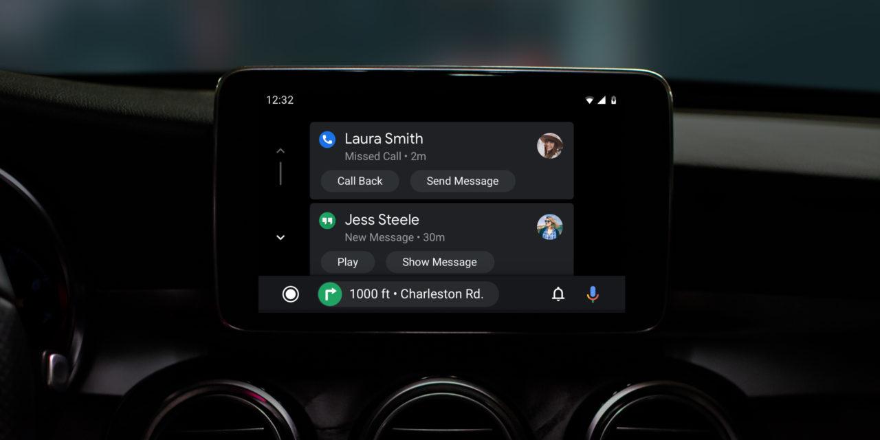
Revealed last month at Google’s IO 2019, a refreshed interface for the search giant’s car-connected Android Auto platform has started rolling out to users from today, as reported by Android Police.
According to Google’s original announcement, the latest Android Auto release is “built to help you get on the road faster, show more useful information at a glance and simplify common tasks while driving.”
- Android Auto: Google’s head unit for cars explained
- Android Auto supports wireless, as long as you’ve got the right phone
- Pros and cons to using Android Auto on a 2019 Honda Passport
Going through changes
With regards to getting you on the road quicker, Android Auto will now automatically continue playing your media when you turn on your vehicle and immediately launch your chosen navigation app. From here, users can either tap on a suggested destination or issue a voice command.
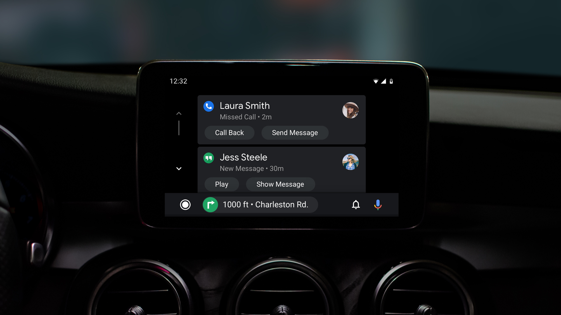
Android Auto’s navigation bar has also been simplified, meaning users should be able to control their apps with less taps while also having the ability to control media, receive incoming calls and turn-by-turn directions from the same screen.
Image credit: Google
Perhaps the most exciting aspect of Android Auto’s interface refresh however, is the inclusion of a new dark mode, which should make driving at night a whole lot easier on the eyes. Google says the new dark theme is complemented by easier to read fonts and and more colorful accents for improved visibility.
Additionally, the new Android Auto UI is said to make it easier to manage calls, messages and alerts thanks to an updated notification center, and has also been optimized to show more information on wider displays. You can check out the new-look Android Auto interface for yourself in the video below.
Source:: TechRadar Portable Devices

